All assets were fully designed and implemented by me.
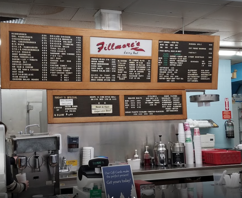
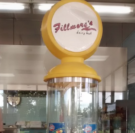
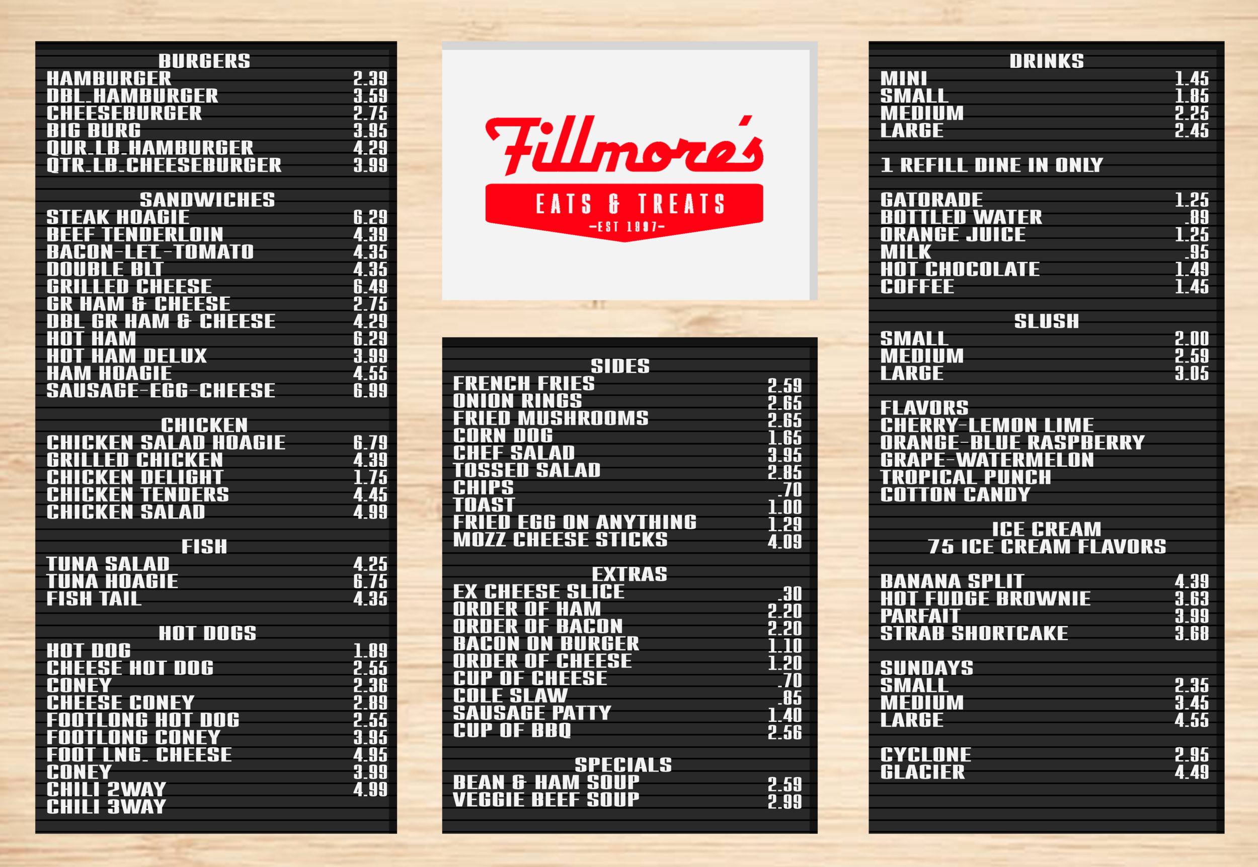
Fillmore’s is a local Florence, KY comfort food restaurant. Think burgers, mac n’ cheese, ice cream, and add a fried egg to ANYTHING on the menu. I decided as a personal project to give the Fillmore’s brand the refresh it deserved. Below you’ll see old brand elements vs the new ones i created.
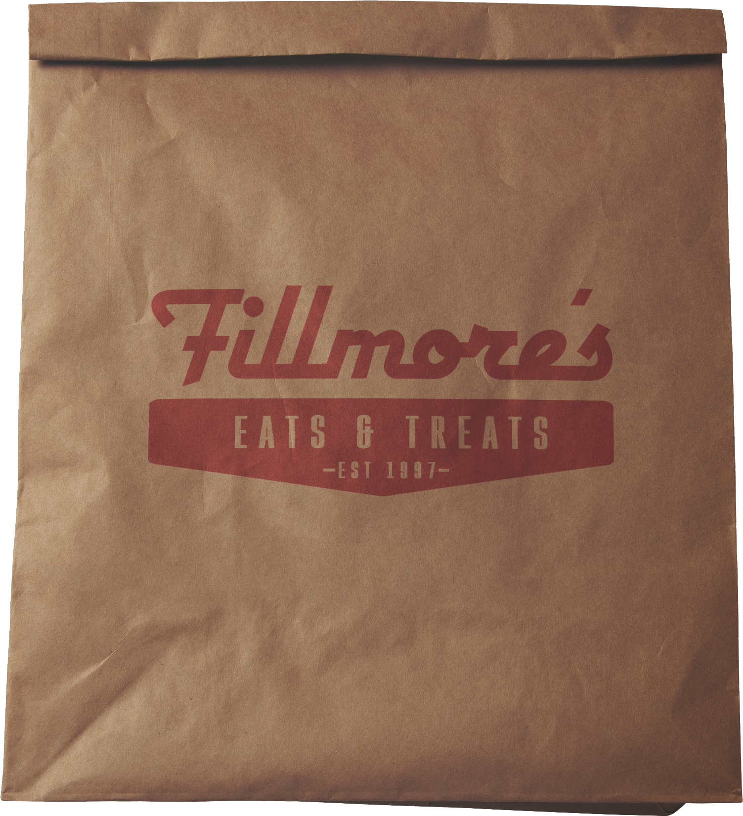
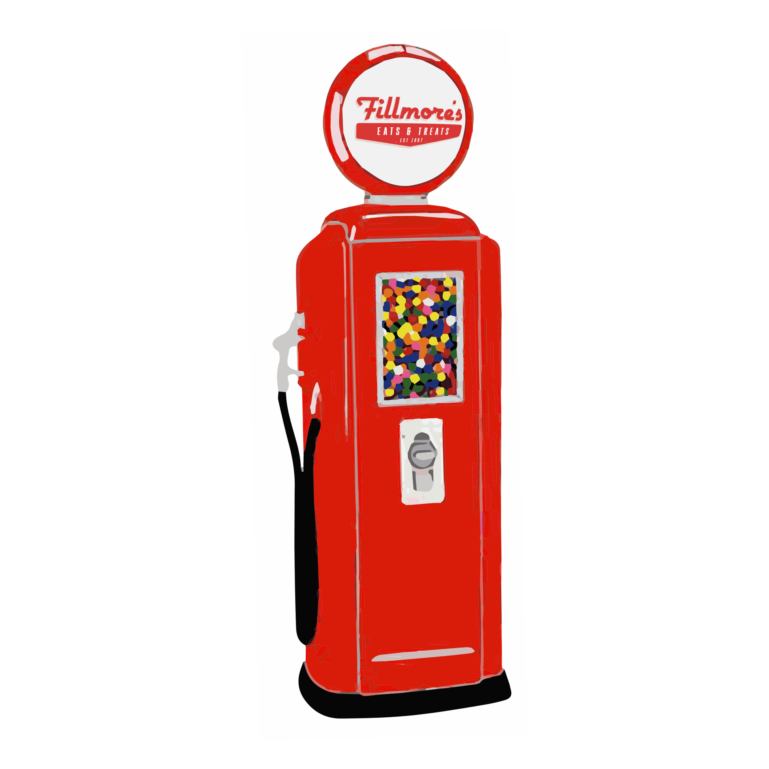
Fresh New Logo
Every weekend Fillmores hosts vintage car shoes, i wanted to keep this theming in mind when creating the new logo. The old logo does this with the small flame under the name. In the new logo the shape that encases the sub text of the logo is reminiscent of vintage gas pumps.
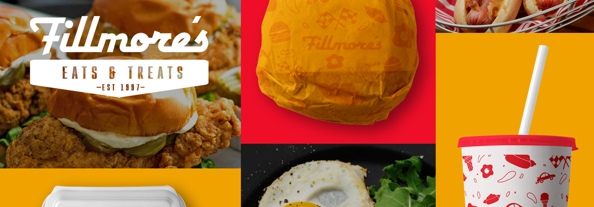
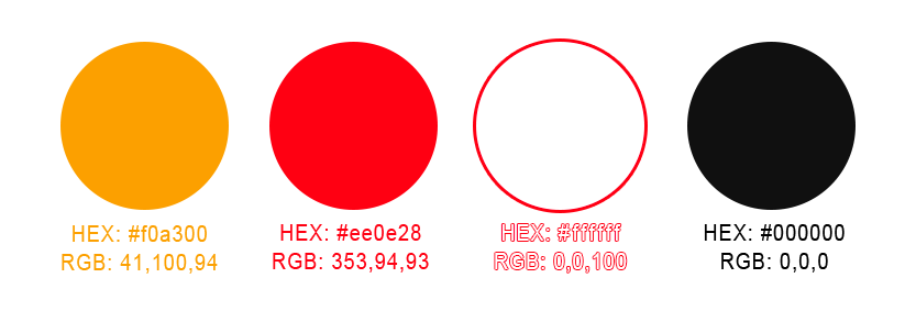
Bold Brand Colors
Brand Collateral
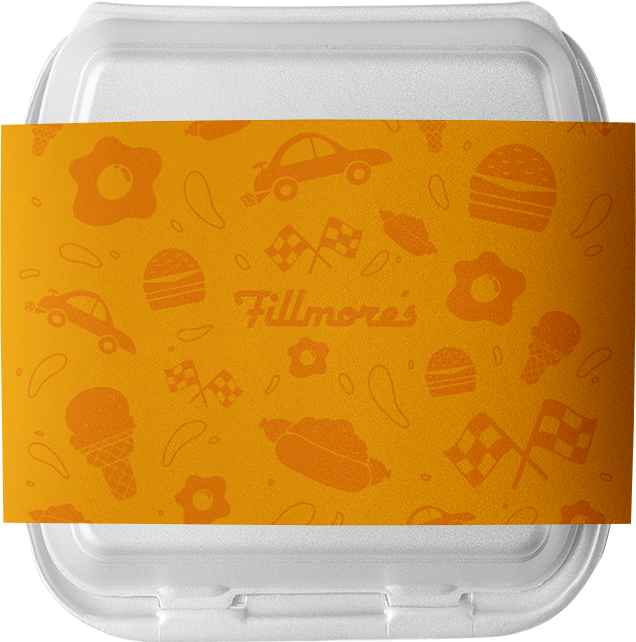
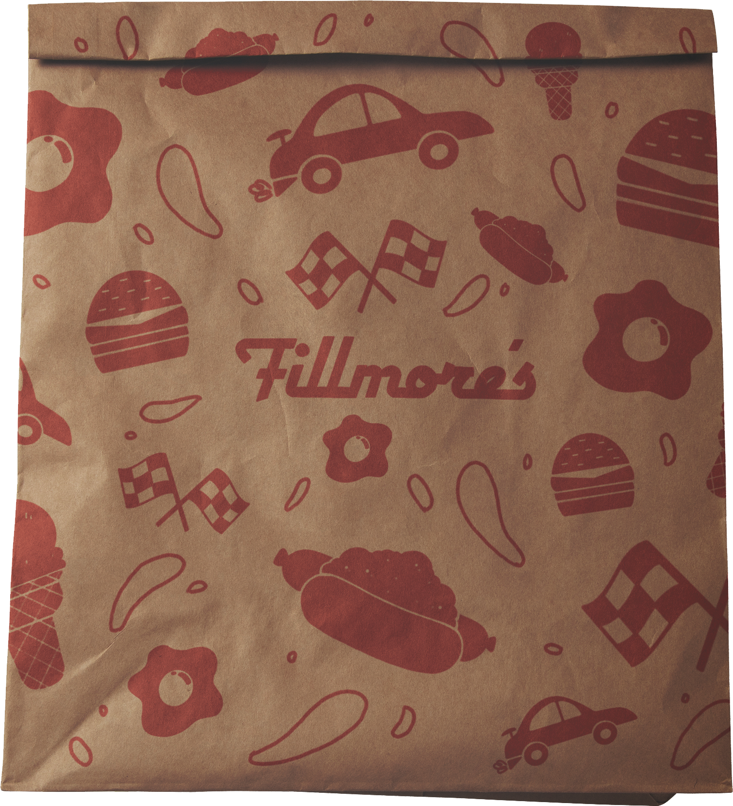
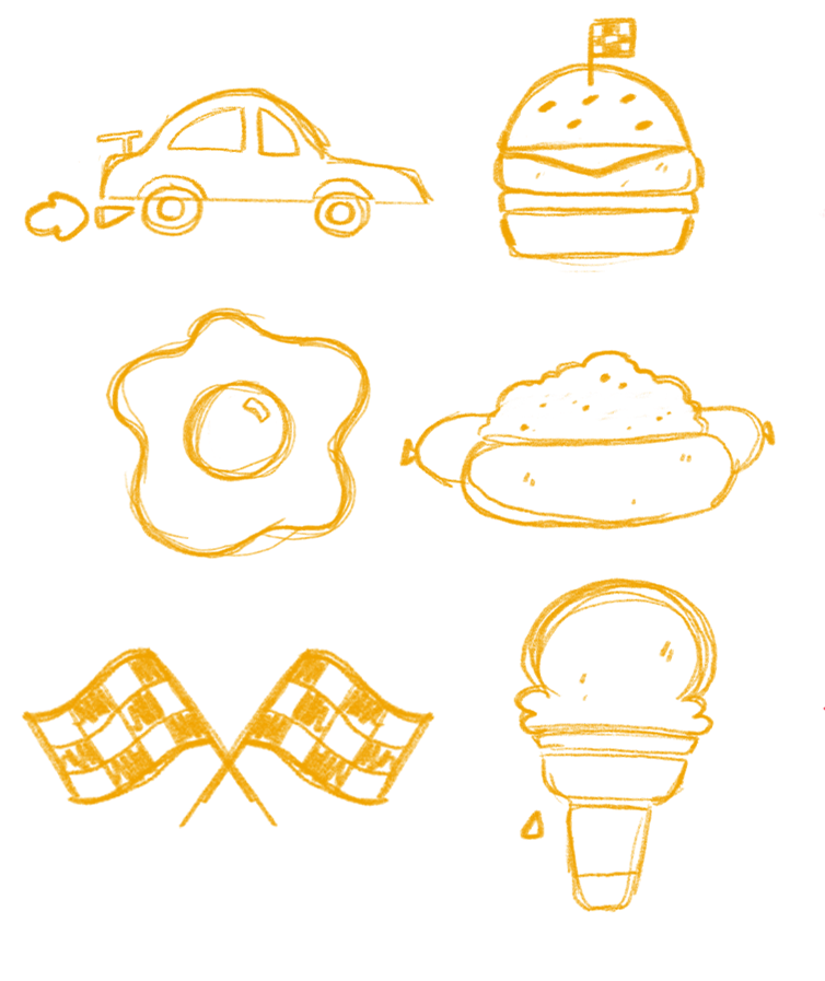
Pattern Illustrations
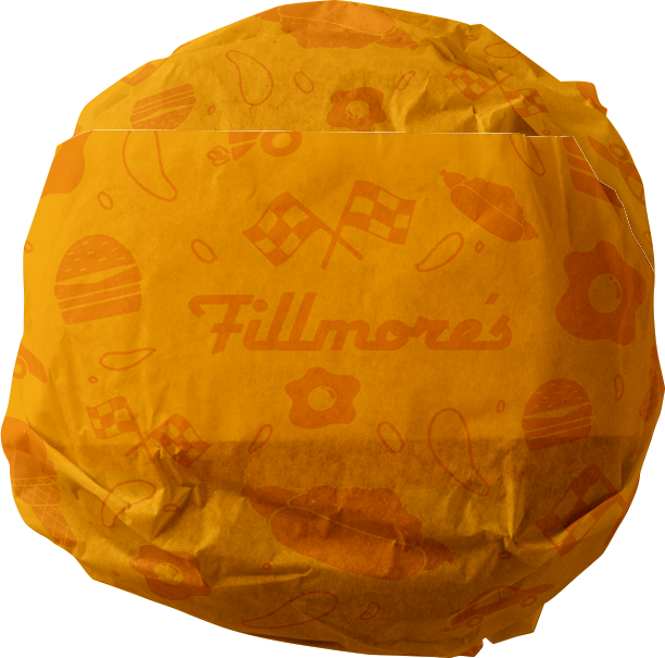
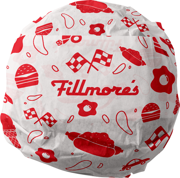
I chose to create a pattern out of small graphic illustrations of icons that remind me of Fillmore’s. Multiple images tie back to racing and cars, a chili dog to symbolize their foot long chili dogs, a fried egg that can top any meal, and an ice cream (of which they have 57 flavors).
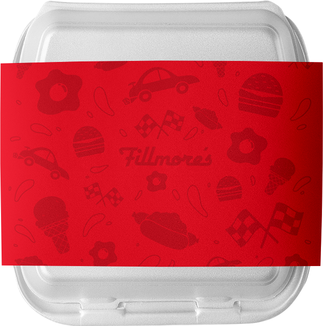
Refreshed Interior
Below are a few interior items with refreshed branding
To-Go
Take away bag mockups